Accessing detailed Form Reports
The reporting for your forms and surveys provides a summary of results along with associated data and meta-data.
Steps to access a Form Report
- Go to the "Dashboard" > "Reports"
- Select "Results" in the left-hand menu
- Find your survey in the list and click the 'View Results' link
- Select the desired date range from the dropdown menu at the upper-right of the report. By default, the last seven days are shown.
The form report has four sections:
- Summary - Shows the results of your forms and surveys using summary tables and dynamic visualisations.
- Overview - Shows meta-information about the activity, including when participants' left contributions, what devices they used, and known demographic information for registered members.
- Data - Shows results in a tabular format that can be exported in .xlsx, .csv and .pdf formats.
- Analysis - Lets you view text-based responses to open-ended questions and use text analysis tools.
Form Reports Filtering
The
Form Tool includes additional filters that offer more detailed
insights, allowing users to create tailored views of specific responses
and trends.

- Filter by specific form data/questions (e.g. multiple choice, text fields, Contribution ID).
- Member profile filters (e.g. username, email, postcode).
- Multiple filters can be applied together for refined results.
-
Filters persist across all reporting tabs (Overview, Summary, Data).
- Filters apply to exports, keeping reports consistent with on-screen data.
- Overview/Summary exports display active filters for transparency.
Summary
The
Summary section displays the results for each question in a form or survey using dynamic visualisations and summary tables.
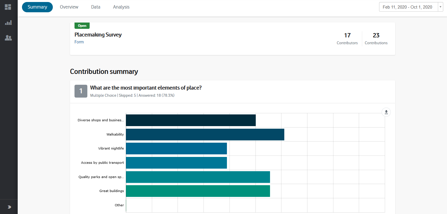
You can export the report as a .pdf by clicking the 'Export' button at the top-right of the page.
Responses
to quantitative questions such as multiple-choice, rating, ranking, and
matrix questions are automatically aggregated and analysed, while
responses to open-ended questions can be summarised with Social Pinpoint's
text-analysis tools (see below).
The way responses are analysed depends on the type of question asked in the form or survey.
Hide Question
You can now choose which questions appear in the on-screen Summary page.
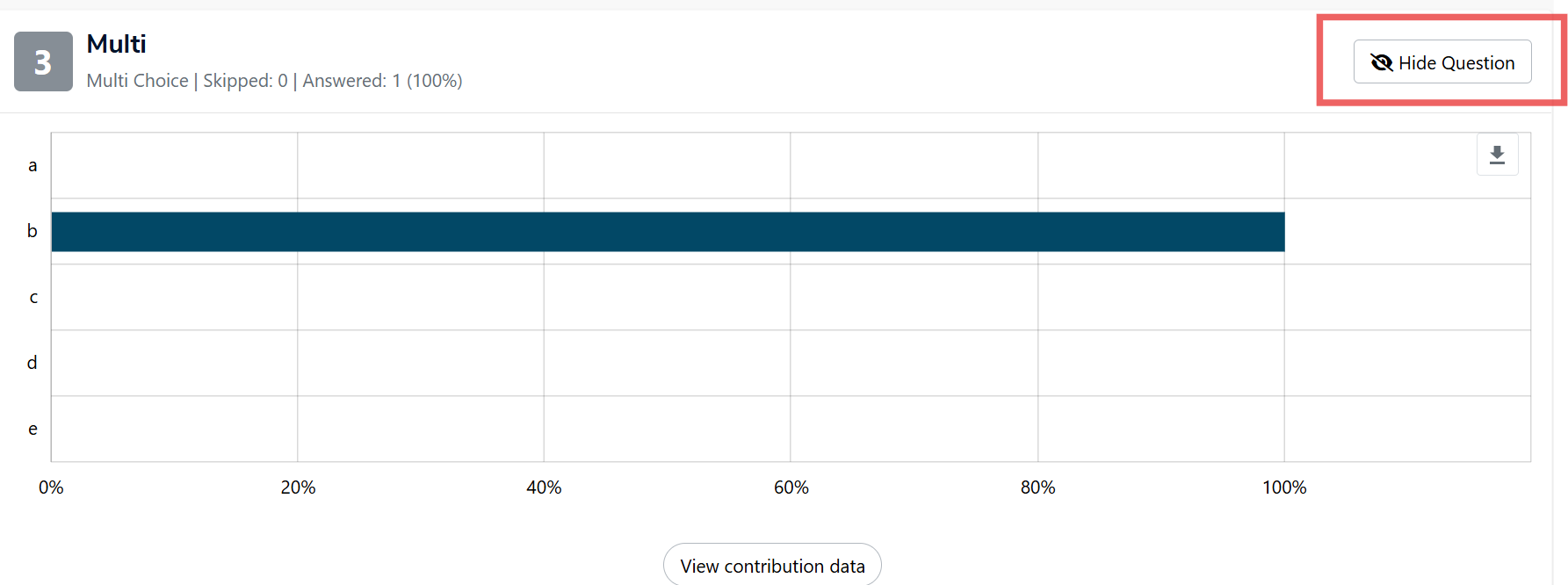
- Use the eye icon to toggle a question’s visibility (open = visible, crossed out = hidden).
- Hidden questions are greyed out in the interface and are excluded from the PDF export.
- You can restore hidden questions at any time by clicking the toggle again.
💡NOTE: Question numbering remains consistent to ensure transparency, even when questions are hidden.
Overview
The Overview section provides high-level information about your form or survey, giving you insight into how participants engaged with it and who they were.
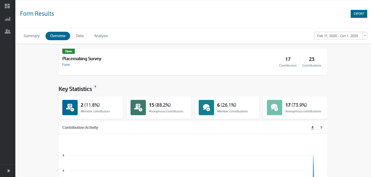
It includes information on:
- Form Details
- Provides information about the form or survey including its title,
description, whether the form is open or closed and the number of unique
contributors and total contributions collected.
- Participant Type - Shows the number of unique contributors and total contributions coming from registered members and anonymous participants.
- Contribution Activity -
Provides a 'line' graph showing the total number of contributions
collected per day, split between registered members and anonymous
participants.
- Technology - Indicates the device types and browser types used by your participants when making a contribution to the form.
- Member demographics -
Shows the demographic details of any registered members including age,
gender, age by gender, location, and categories and locations of
interest.
Data Form submissions
The Data section of the Form tool displays the full results of your survey or form in a tabular format. Each row represents one contribution (submission) from a participant, while each column represents a question, member detail, or metadata field.
This is where you can:
-
View and analyse response data
-
Filter results
-
Export data for further reporting
-
Manage which columns are visible and included in export
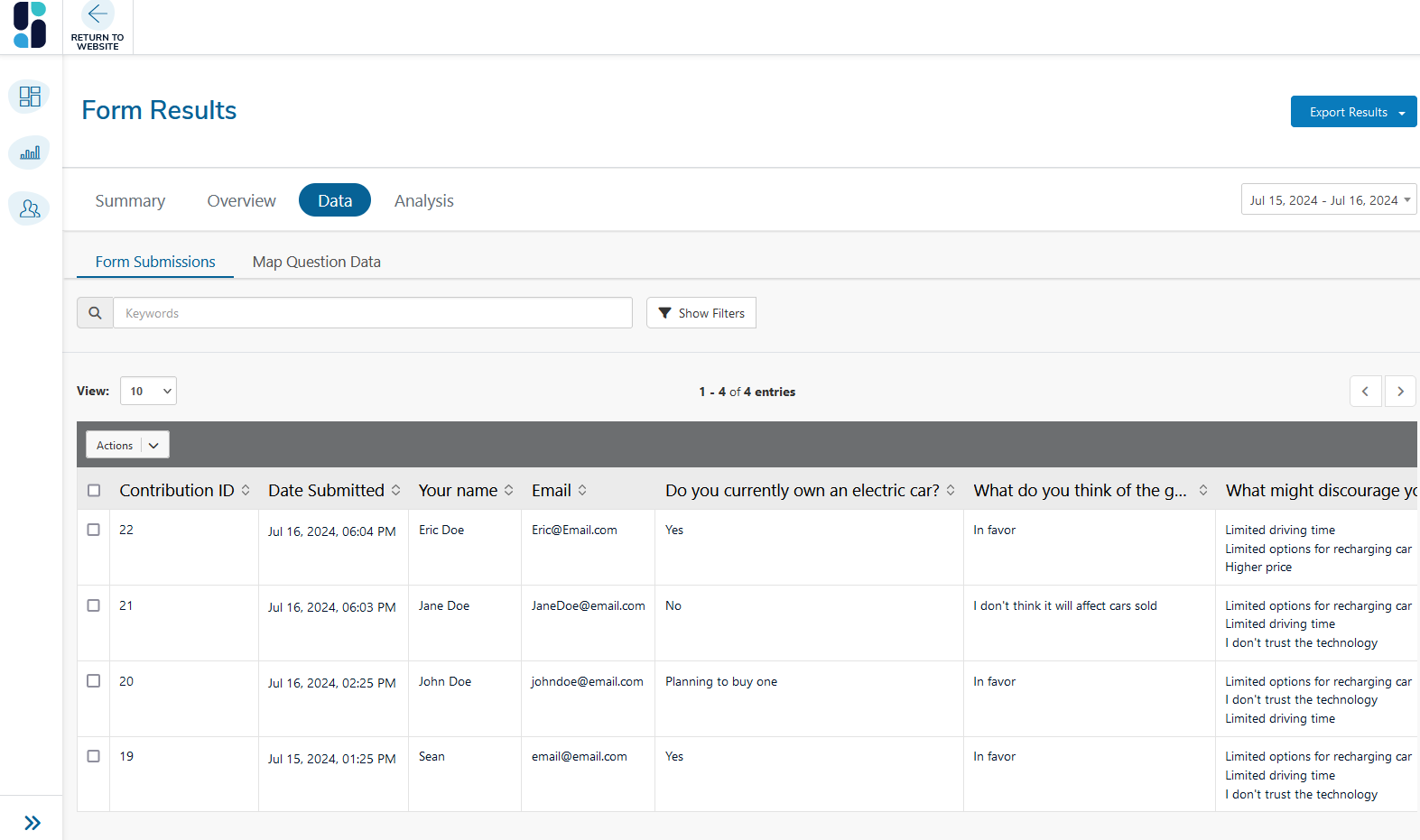
In addition to a column for each question, the following fields are shown in the data table:
- Contribution ID - A unique identifier for each contribution.
- Date Submitted - The date and time the contribution was submitted.
- IP Address -The participant’s IP address (masked for privacy). Useful for identifying patterns, i.e. multiple contributions from the same network.
- Member Status - Whether the member status is 'Active' or 'Inactive'.
- Member ID - The unique ID number of the member.
- Member Username - The member's unique username.
- Member Email - The member's email address.
Only
contributions from participants who are registered members of the site
will have data in the member fields. Member data is dynamically copied
from a member's user profile meaning it gets updated when their
information is changed (via their user profile).
Any custom member fields added to your site (as part of the registration form) are also added to the data table.
Filtering Results
You can filter your data to focus on specific submissions or trends:
-
Click Show Filters at the top of the table.
-
Select your desired filters (e.g. date range, member status, answers to specific questions).
-
Click Apply Filters.
Applied filters will also affect any data you export.
🆕Managing Columns
A new function that gives you full control over which questions or fields are displayed in the table and included in the exports.
- In the Data section select 'Columns' (opposite of the Actions dropdown)
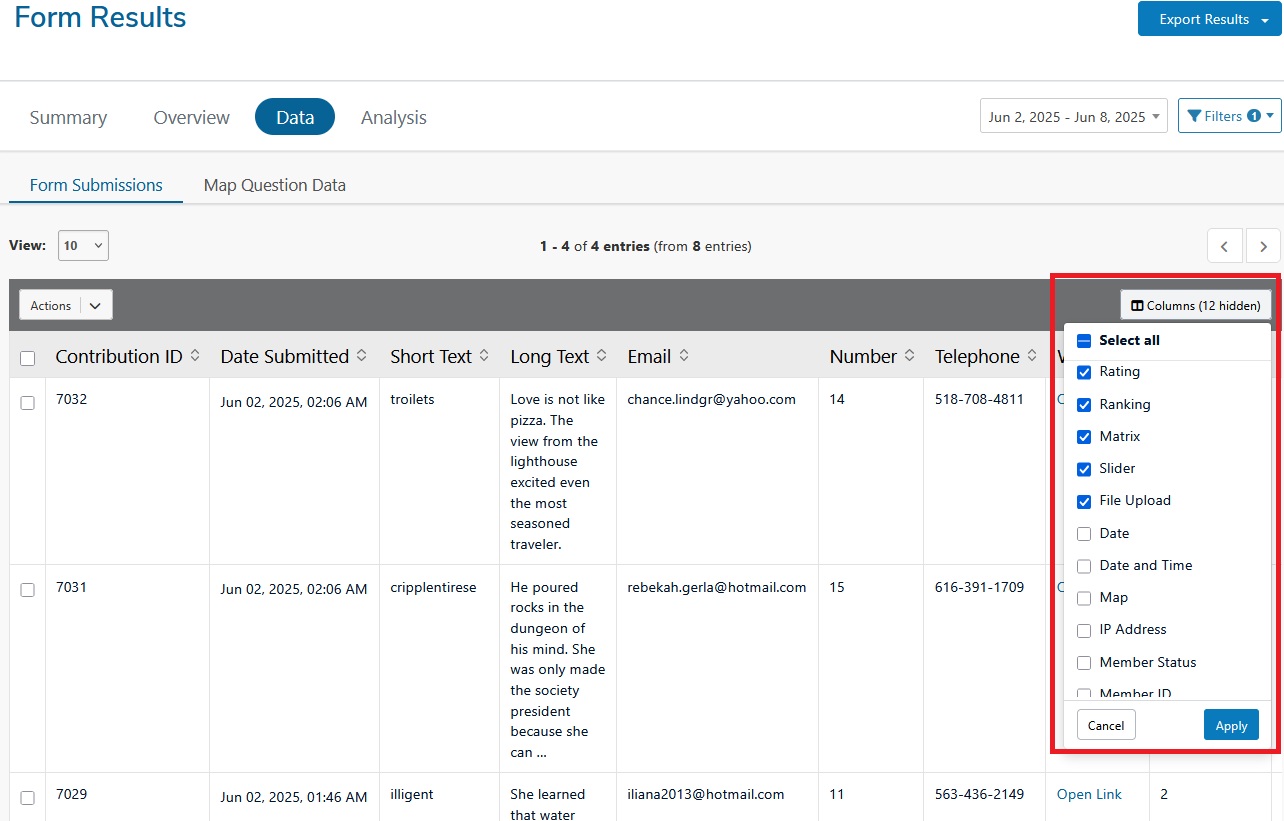
- From the pop-up window, all columns will be selected by default and you can de-select any columns you want to hide.
Note: Any hidden columns will also be excluded from data exports. - Click Apply to confirm your selection
You can deselect questions, metadata or member fields. The filter will still apply to the full data set - even if a column is hidden. This feature is particularly useful when preparing reports for specific audiences or when handling sensitive data.
Data exports
You can export the Form data in the following formats:
To export, apply your filters or manage columns settings as needed, select 'Export' in the top-right corner of the page, then select your desired file type.
💡NOTE: Any filters or column selections you apply will be reflected in the exported file.
Download Notifications
When exporting large datasets, you will now see a notification when your data download is ready. This prevents you from having to wait on a loading or processing screen you can continue working while your export is prepared.
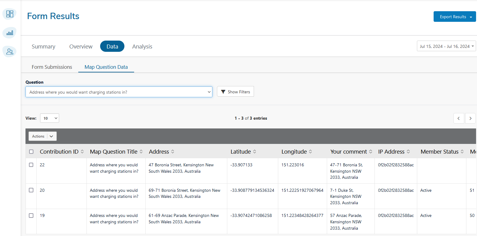
Map Question Data
In addition to the fields common to all data tables, the map question data table includes:
- Map Question Title: The title of the map question.
- Address: The address specified by the participant.
- Latitude: The latitude coordinate of the specified location.
- Longitude: The longitude coordinate of the specified location.
- Your comment: Any additional comments provided by the participant related to the map question.
Below is an example of how the data from a map question might be displayed. This data can be filtered, exported, and analyzed in the same way as other survey data.
Analysis
The Analysis section lets you view individual text-based responses
collected through any Short Text or Long Text questions in your forms.
It also contains a number of tools that help you analyse the data, so
you can summarise and present results for qualitative questions.
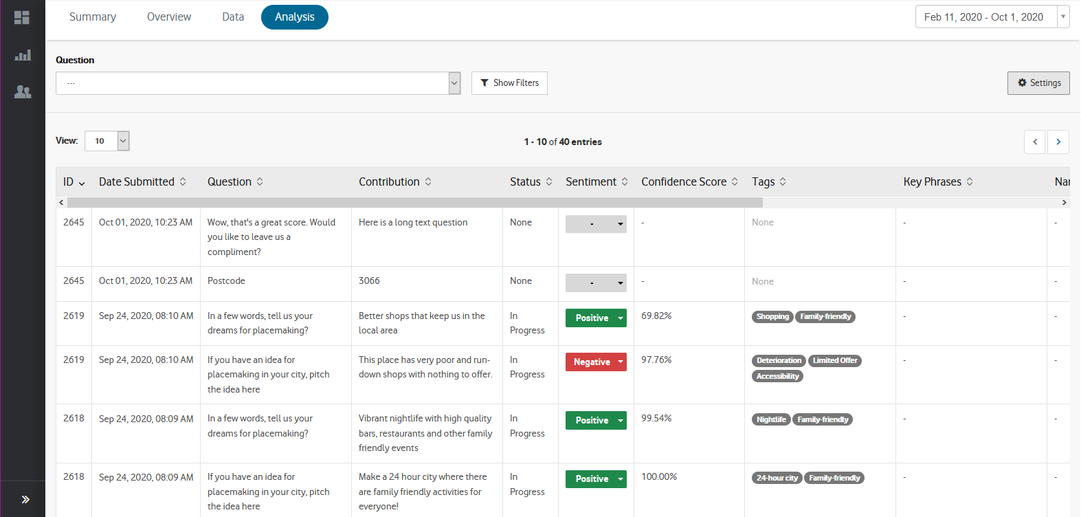
The following fields are shown in the data table:
- ID - Provides a unique number to identify the response.
- Date submitted - The date and time the response was submitted.
- Question - The question title that participants responded to.
- Contribution - The response submitted to the question.
- Sentiment - The sentiment classification assigned to the response ('positive', 'mixed', 'negative', and neutral).
- Tags - Words or phrases assigned to the response as determined by the user.
- Featured - Responses that are selected to appear in the 'Featured Contributions' section of the Summary report.
- Bulk Action - Allows you to perform bulk actions on the selected contributions.
- Actions - Additional functions that allow you to view the entire contribution and its data in a pop-up window.
All
responses can be viewed together, or filtered by individual question by
selecting the 'Question' dropdown at the top of the table. Clicking
the 'Show Filters' button provides additional options
to filter responses such as 'Tags', 'Sentiment' and whether the response
is 'Featured'. Once filters have been selected, click the 'Apply
Filters' button.
Data can be exported as .xls or .csv
by clicking the 'Export' button at the top-right of the page, and
selecting the desired file type. Any filters you have applied to the
data table will also be applied in the data export.


